Making good typography for web is hard. And crafting solid html for email campaigns makes it even harder.
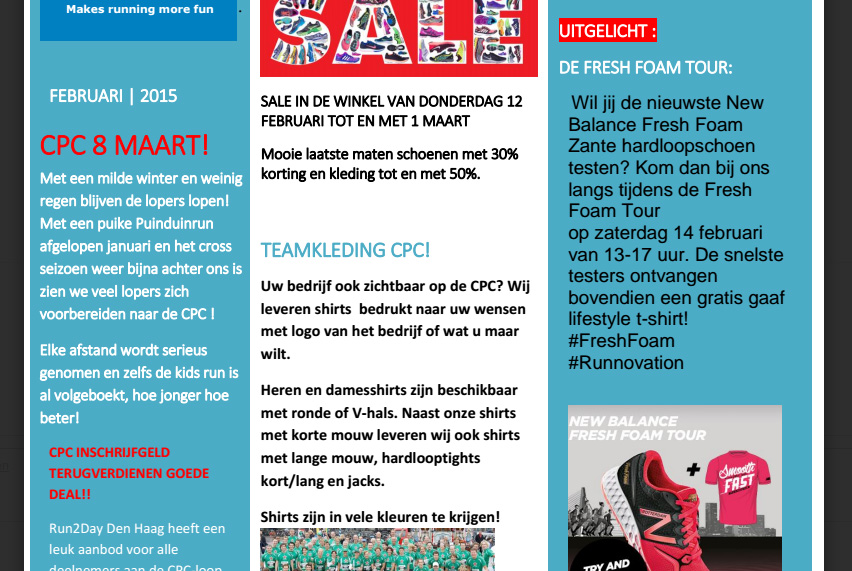
Sometimes I will receive newsletters with questionable typography, like the mailing in the image below. Maybe the designer got a little carried away here, or maybe the way my mail client renders the html is to blame. In any case, this is *hard* to read.

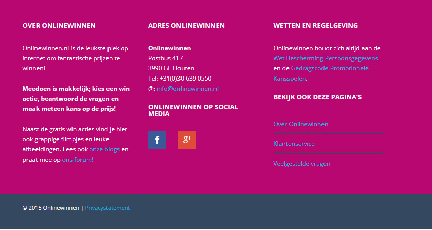
I saw this and thougt, “that’s pretty much as bad as it gets these days.” But then I stumbled upon a site that has this beast for a footer.

Wow. This is one of the sites that tools like online contrast checkers exist for.
Brrr